Get In Touch
andrehmo@hotmail.com,
Ph: +49 176 216 49 147
Back
Apps UX/UI
April 30, 2022

Check Point

Context

With the rise of online sales, shopping centers face unprecedented challenges. The “Check Point” project emerges as an innovative response to this trend, aiming to revitalize the physical shopping experience through a user-centered app.

Objective

To develop an app that uses gamification to enhance customer engagement in shopping centers, offering a rewards system that encourages more frequent and extended visits.

Task

A major challenge in the “Check Point” project was overcoming stakeholder skepticism about integrating digital solutions into traditional shopping environments. I addressed this by demonstrating the app’s potential benefits through data-driven insights in focused workshops, which helped gain their trust and support for the pilot phase.

  • Strategy

    UX Research

  • Design

    UX/UI Design

  • Client

    Check Point

The Problem

According to a study by Canuma Capital, online sales in 2021 reached R$260 billion, marking a 60% increase compared to 2019. In contrast, shopping centers saw their sales decline, falling nearly 9% over the same period. This decline highlights the urgency of adapting physical shopping experiences to the new market scenario.

Impact:

This decline not only affects profits but also puts pressure on retailers and employees, directly impacting their quality of life and motivation at work, as studies on the work environment and its influence on productivity show.

My Role and Design Process

Responsibilities:

As the principal UX designer on this project, I led the development of the concept, user research, and the creation of wireframes and prototypes.

Research and Analysis:

Initial research included market trend analysis, stakeholder feedback, and relevant case studies. This process helped identify key elements to be incorporated into the design.

Design Process

1. User Research

The research would cover all consumer behaviors and preferences regarding the ‘Check Point‘ application. The study would focus on the trend of consumers visiting the Analia Franco Shopping Center, and more precisely, it would seek out consumers patronizing prestige accounts such as Tommy Hilfiger. This includes technological savviness, usage habits, and preferences for online or physical shopping. The research aimed to capture information on consumer expectations and their willingness to adopt digital solutions to enable more functional shopping habits.

The results of the survey indeed were quite revealing: as many as 90.62% of the respondents had engaged in online shopping during the recent months, which demonstrated their high level of comfort and engagement with digital commerce platforms. However, despite their online activity, 50% showed a preference for in-store shopping experiences, hence underlining the potential for a hybrid digital-physical shopping platform. About 87.5% of the customers appreciated humanized customer service, and discounts became a major factor in their purchasing decisions, with 96.97% favoring discounts when they go physical. These insights were very important in helping Check Point shape its mobile app to bridge the gap in digital convenience-personal touch in in-store interaction.

2. Benchmarking

In analyzing the market and competition, we were able to identify two main profiles: direct competitors and indirect competitors. Direct competitors are those with the same operational profile, the same customers, and similar proposed solutions, thereby targeting the same market niche and audience. The identified competition includes apps from the shopping centers themselves, which may have similar features.

Indirect competitors include companies and solutions that offer similar products and services and aim to reach and win over the same consumer profile. This is represented by cashback or benefits apps such as Ame, Méliuz, Iti, Recarga Pay; apps from the shopping centers themselves, which may have similar features; and online sales from the brands themselves and marketplaces.

3. SWOT

Specific elements that define the strategic landscape within the SWOT analysis of the project are as follows: strengths include a proper communication plan, benefits crystal clear, an advantages club addressed in person, and humanized marketing. The weaknesses lie in the fact that the brand is new in this market niche and its limited knowledge about this market. Its opportunities do come within the same circle as strengths, considering personalized and humanized marketing strategies. However, the threats to the project include the pervasiveness of online sales, the privileges extended by other brands, and similar apps from shopping centers that will affect the market share of the project.

4. Prototyping and Iteration

By incorporating knowledge from user research, benchmarking, and SWOT analysis, a set of prototypes were developed to meet the identified key needs. Our user research showed a great desire to receive personalized shopping experiences and value through discounts. It became apparent from benchmarking against existing solutions that no offering seemed in existence to retrieve a discount both seamlessly and in a personalized fashion within shopping centers. The SWOT analysis also underlined the opportunity for extending the physical retail experience through the use of digital capabilities.

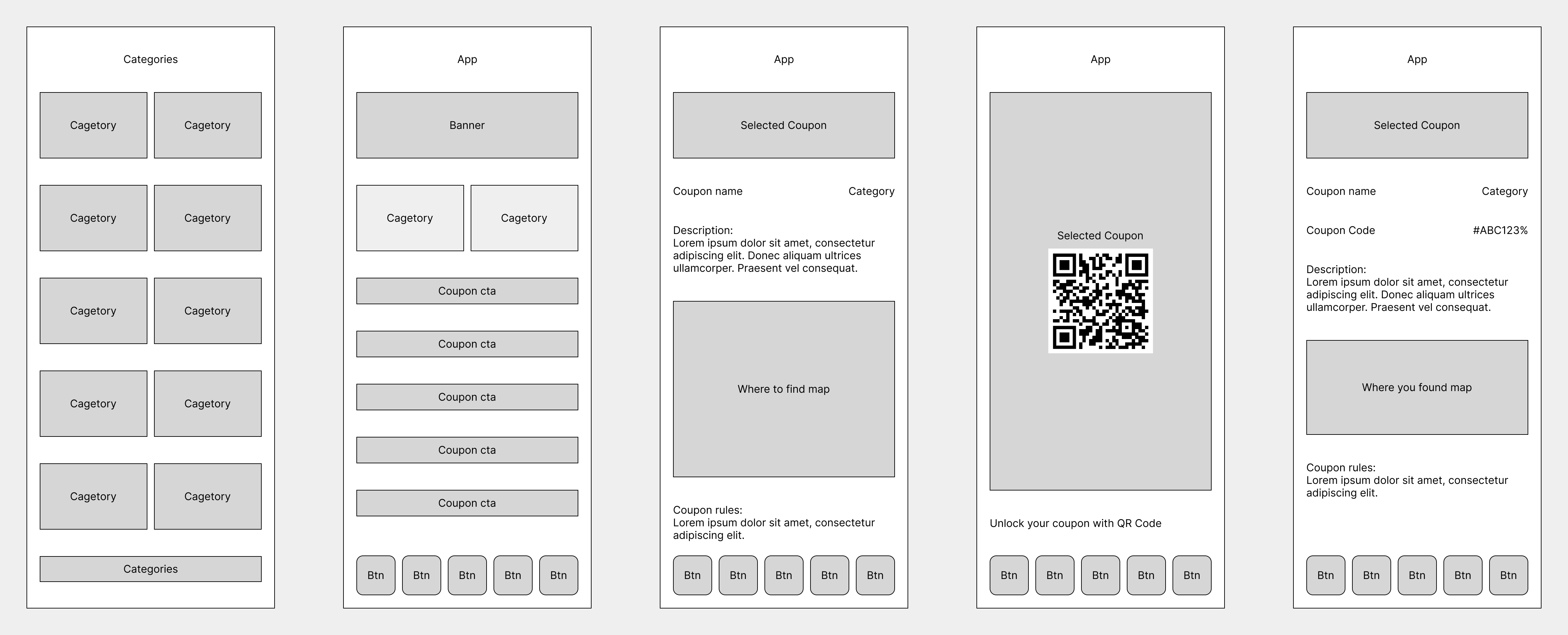
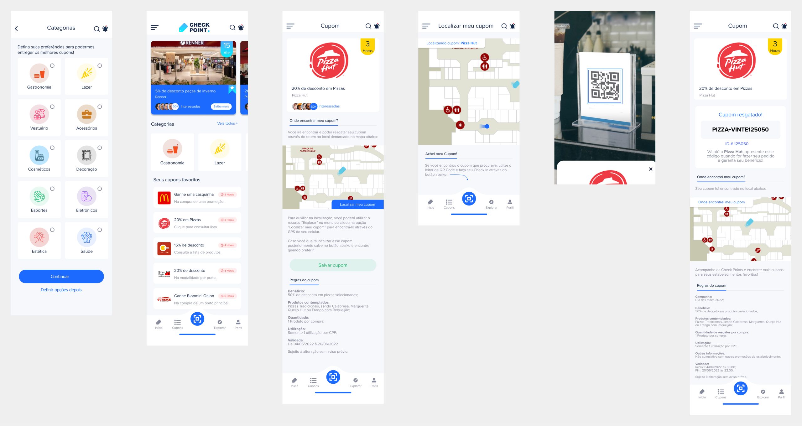
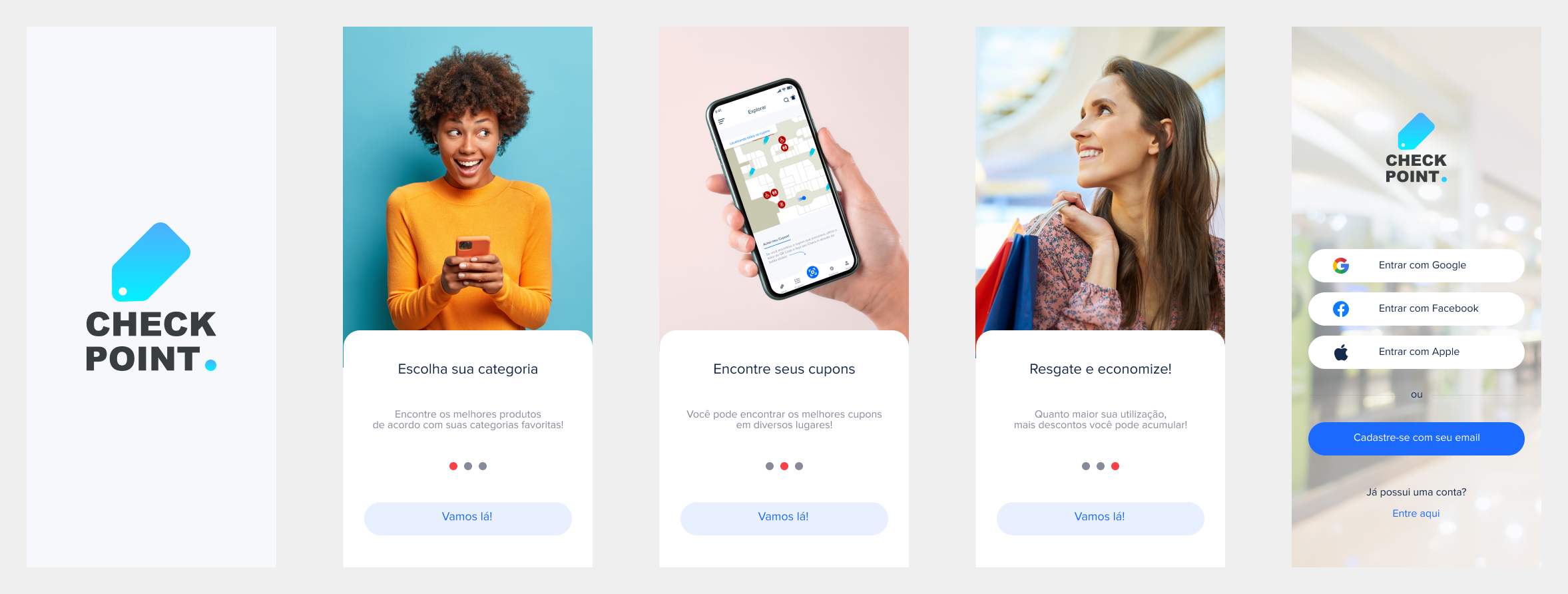
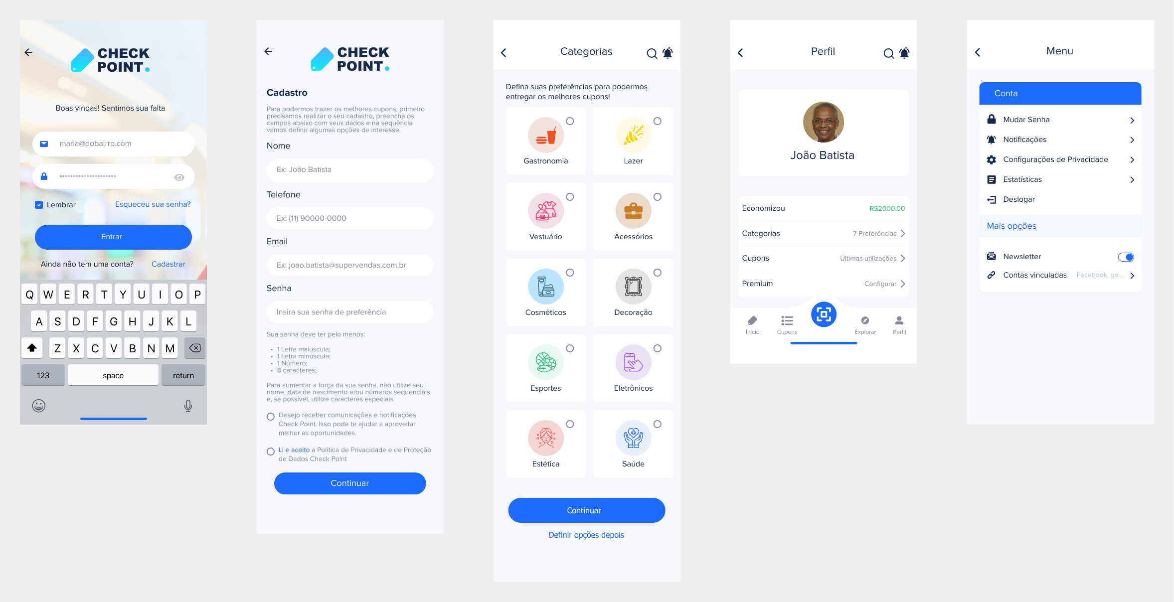
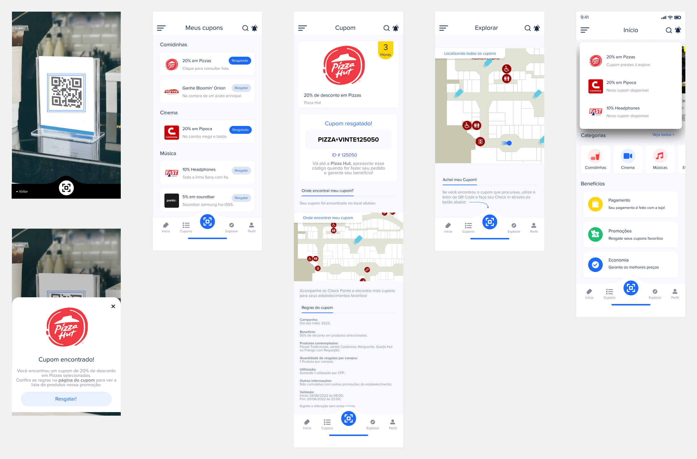
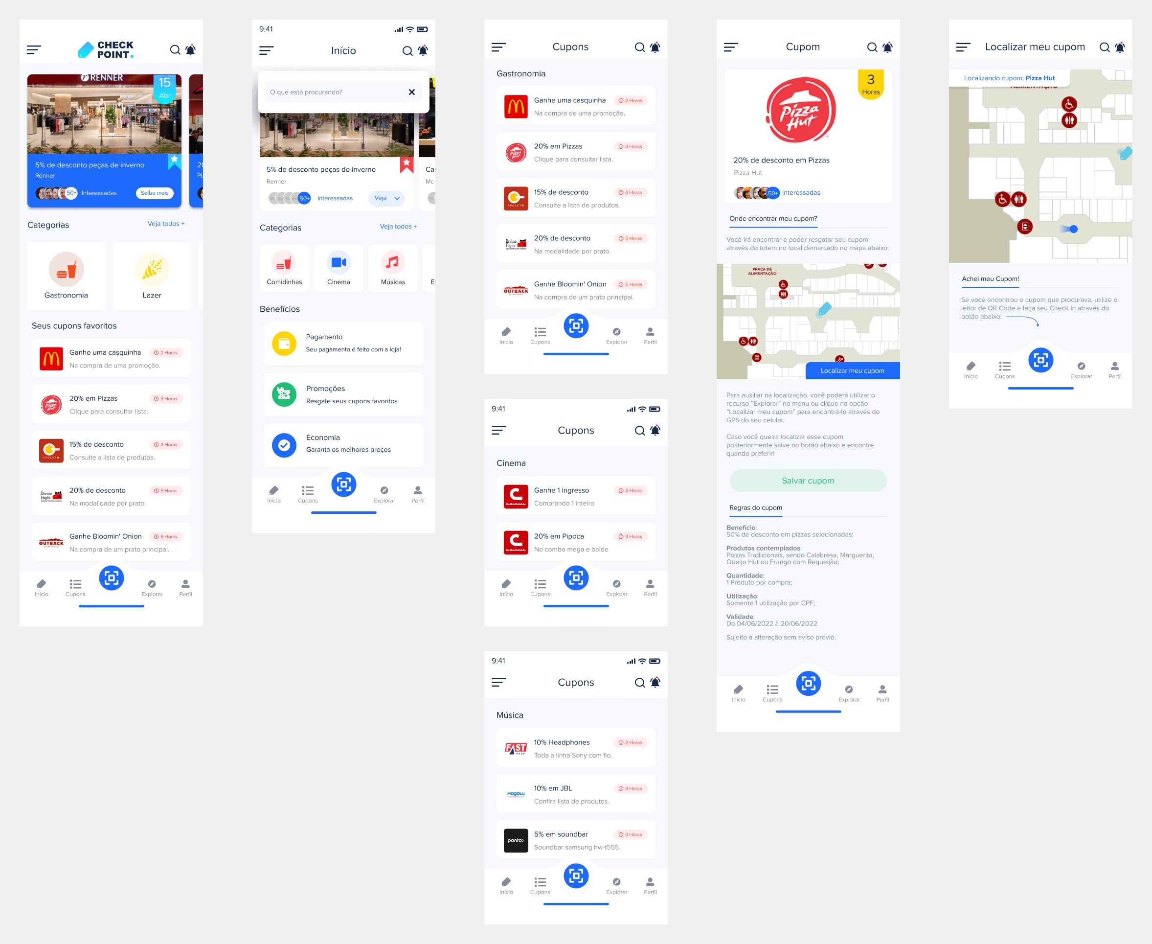
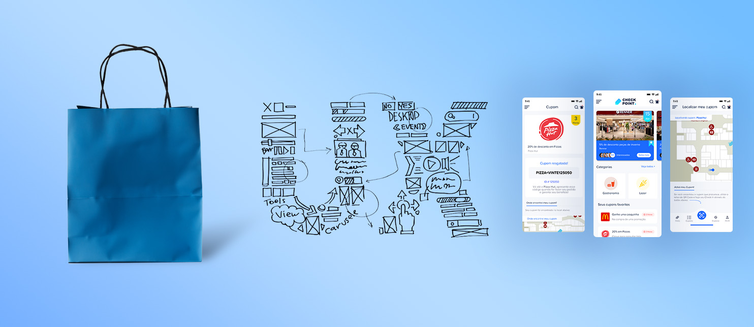
Next, the iterative design process produced a Figma prototype for an application called “Check Point“, which is a mobile application designed to enhance users’ shopping experiences by providing them with appropriate discounts according to preference and location within the shopping center.

It would allow users to view and redeem coupons through an easy-to-use, efficient interface, the discounts of which are tailored to specific shopping behavior and can easily be made available when one enters the shopping center.

One of the key features put into operation after user feedback was the “check-infunction, enabled by QR code scanning through the user’s mobile device. It would not only facilitate a participative shopping experience, but also communicate information to engage the user’s interest for specific locations by providing useful information to retailers so that they could better target their offerings.

The app had undergone iterations, each successive version incorporating more of the user feedback on usability and functionality. Below is an image of the prototype, showing user flow and final design screens.

It is envisaged that the use of this app will increase customer satisfaction through easier access to discounts and also retailer sales with targeted promotions. The solution bridges the gap in digital convenience and the personal touch that comes with in-store shopping, catering to both consumer desires and business objectives.

5. Usability Testing

In general, the “Check Pointapplication is designed to handle two main user flows:

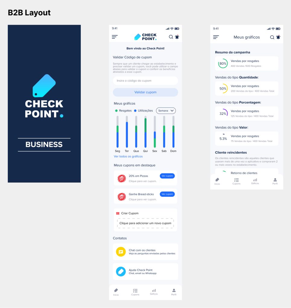
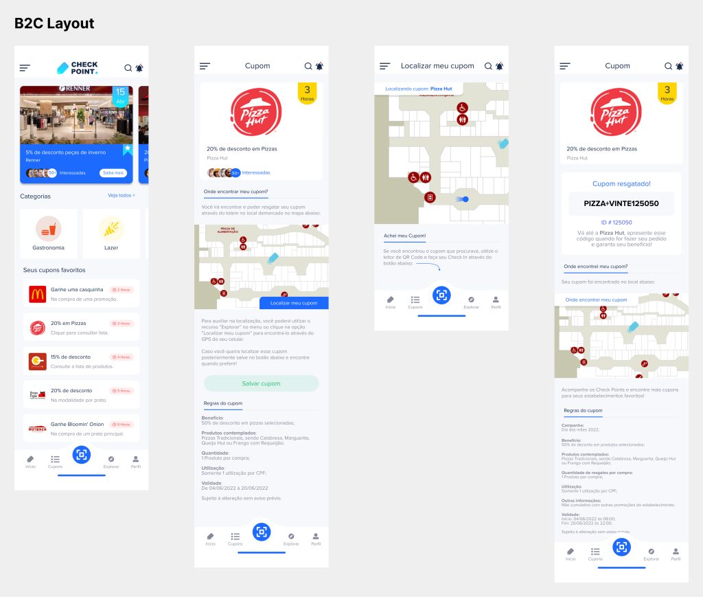
B2C Consumers and B2B Business. Each will require different validation profiles to make an interface intuitive, crystal clear in terms of the benefit. Moderated usability tests allow the ease of checking how the test users move through an application and understand the benefits of the various features.

B2C Validations

  • Brand Recognition: Users must identify the brand and connect with it instantly at first contact.
  • Clarity of App Info and Benefits: Consumers should understand what the use of the app is all about in regard to what it will do for them, right from onboarding to registration—including how coupon redemption works.
  • Screen to Screen Navigation: Make transitions coherent and logical between the different parts of the application.

Validations, B2B

  • Brand Understanding: Like B2C, here also a business needs to identify and understand the brand value at once.
  • APP Information and Benefit Comprehension: Companies should explicitly have a comprehension of the benefits accrued from the app, know difference between various plans and how to create and validate already issued coupons. Seamless Navigation: Transitions among different functionalities should be so smooth and clear that the business user can easily use it.
  • Screen to Screen Navigation: Make transitions coherent and logical between the different parts of the application.

Desired Outcomes implies that by these tests, we would be confirming whether the user knows as described and also find problems in flow, navigation, and text that could affect app usability. Therefore, a flag for the gaps and inconsistencies from a user’s point of view now will be enabled by this so that improvement could be done in line with his needs.

This will be an important iteration cycle for our chosen strategies and which pathways may be in need of realignment or expansion. Smoothing out the kinks now means that, in the future, functionalities come fit, solving challenges as they are identified in a much more effective manner.

These kinds of insights helped further in continuous improvements of the app to be useful and user-friendly for the consumers and business users of the “Check Point” application, thereby enhancing their engagements and satisfactions.

6. B2C Usability Test - Observation and Response

Tests of the “Check Point” application targeted B2C users for the purpose of affirming functionality, ease of use, and usability of the overall experience with an application. Each participant’s experience was unique and combined for incredibly valuable insight into the strengths and areas for improvement needed in this application.

Overview of User Interactions

The practices adopted for recruiting participants were onboarding, navigation of screens, redemption of coupons, and getting an understanding of the benefit system of the application. Results from these participants reveal that onboarding is fluent and that the user is enjoying the process; however, some did mention some information as not intuitive for picking up, like looking for and redeeming their coupons. Navigation between sections, in general, was satisfying; participants actually appreciated it because it was neat while the design features clear instructions.

Specific Participant Comments

  • Isabela Papini found the “Banner destaque” very catchy, giving attention to that section and guiding users to desired categories. However, she found it a little more difficult to understand how check-in was done, let alone claiming coupons with no explanation.
  • Milena Papini had no problem with how the onboarding introduction was done, finding the general structure quite appealing for a positive user experience. She recommended, though, that some of the icons and text about coupons could be made clearer in order to understand faster.
  • Vera Mendes liked the interactive features, including check-in. She felt that not all of the features were intuitive with respect to using a coupon, however.
  • Nágela Araújo appreciated the simplicity of the application but suggested that the coupon validation process could be made easier for a better user experience.
  • Aline Freitas pointed out that there were places that needed to have instructions more clearly stated, so that all users could intuitively navigate and use the app’s features without confusion.
  • Camila Silveira and Stefhany Barbosa say that the app intuitively, but still, if notice was given that discounts can be better for them, then a higher engagement will arise.

Consolidated Observations

The user feedback was more about the necessity for intuitive and clearer instructions in those areas of the app where a person is supposed to find or redeem coupons. Much of the users appreciated the human-centered approach in design, which allowed for a more personalized interaction with the app’s features. The tests also manifested that although the overall design of the app is effective, some users sought greater immediate clarity in immediately locating specific features such as discounts and coupon usage.

Conclusion

These insights from the usability tests provide a basis for iterating on the current design of the “Check Point” app so that it better satisfies consumer needs. Critical issues for improving usability include enhancing feature visibility, making the process of coupon redemption easier, and instructional content is easy to understand and accessible by all intended audiences. Further development will need to be informed by this review so that the application will meet and possibly exceed customer expectations in their shopping experience.
6. B2B Usability Test - Observation and Feedback

The “Check PointB2B usability testing had as its primary focus the evaluation of the application from a business user’s perspective, especially how those users would interact with the features and value of the app to help drive superior commercial engagement and promotional capabilities in a shopping environment.

Key Observations
Brand Understanding and Onboarding: Business users reported that they initially understood the brand and the utility of the app during the onboarding process in relatively quick time. They liked the simplicity in the layout as it was rather easy to get through the various features of the app. Presentation of information in a clear manner was what they needed to understand how to leverage the app in channeling customers and managing promotions.


Design for Differentiation and Coupon Management: The differentiation this app provided between the different subscription plans and how promotions are managed was very important to them.
Features regarding easy customization and tracking of promotional campaigns were much appreciated. Several users suggested that the process of creating and validating coupons needs to be more intuitive, which indicates further simplification in design and clear instructions.

Navigation and Usability: Overall, the feeling toward navigation was positive; businesses described the interface as friendly. A few noted that guidance on some of the more complex features would go a long way in enhancing their experience since they could use all the tools at their disposal without knowing too much about training.

Participant Response

  • Alexandre Silvério, the experienced retailer, mentioned that while doing the set-up for the promotion campaign was the smoothest possible, there can be real-time analytics as well to track campaign performance from the dashboard.
  • Rogério Lima owns this small chain of boutiques. He appreciated the seamless integration with CRM systems. According to him, this would tremendously improve engagement by enabling more customized push notifications based on consumer behavior.
  • Shiraishi Ricardo runs a technology gadget store. Although he was impressed with how this app simplified promotions for him, he did tell them to include features for getting fast feedback from customers about promotional offers-nice additions that could be made.


Consolidated Insights

The feedback of B2B usability studies certainly provides that there needs to be a tradeoff between functionality and ease of use. While very high scores in enabling the efficient management and promotion of offers by enterprises, certainly could improve in regard to real-time analytics or mechanisms for feedback and increased support for custom notifications. This would provide meaningful insights necessary in adapting the application to business needs, while helping to attract and retain more commercial users by equipping them with the most powerful yet easy-to-use tools.

7. Refine and Documentation

This phase focused on translating the insights gathered from the usability testing into tangible application improvements to enhance both user interface (UI) and user experience (UX).

Interface Improvements

Navigation Enhancements: Simplified and more intuitive navigation paths were implemented. This was particularly important for ensuring that features were easily accessible to both B2C and B2B users.

Feature Enhancement

Personalized Notifications: Based on feedback, especially from B2B stakeholders, the notification system was upgraded to support more targeted messaging based on user behavior and preferences.

Coupon Management System

Streamlined Processes: Refined the process for creating and managing coupons, making it more intuitive and less time-consuming for businesses.

Documentation

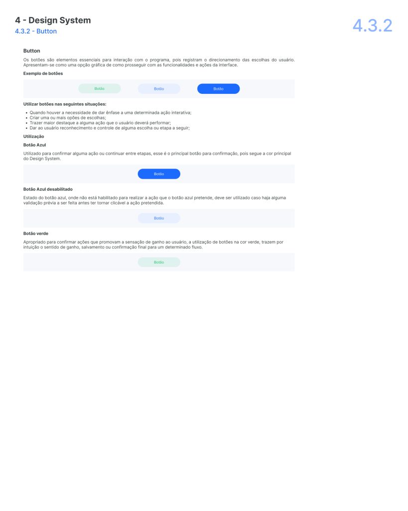
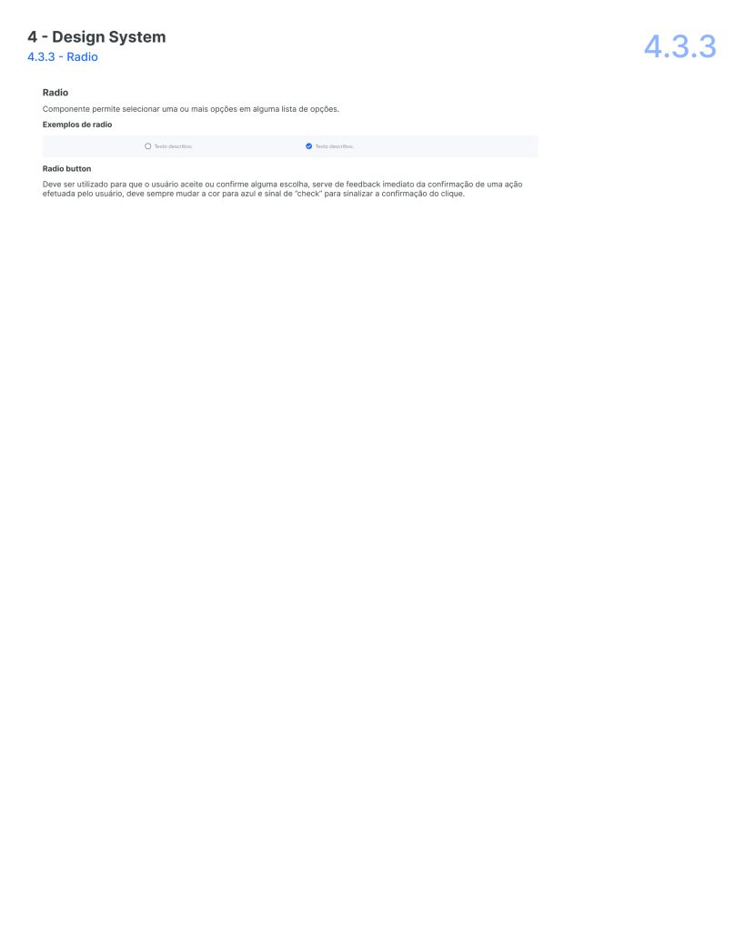
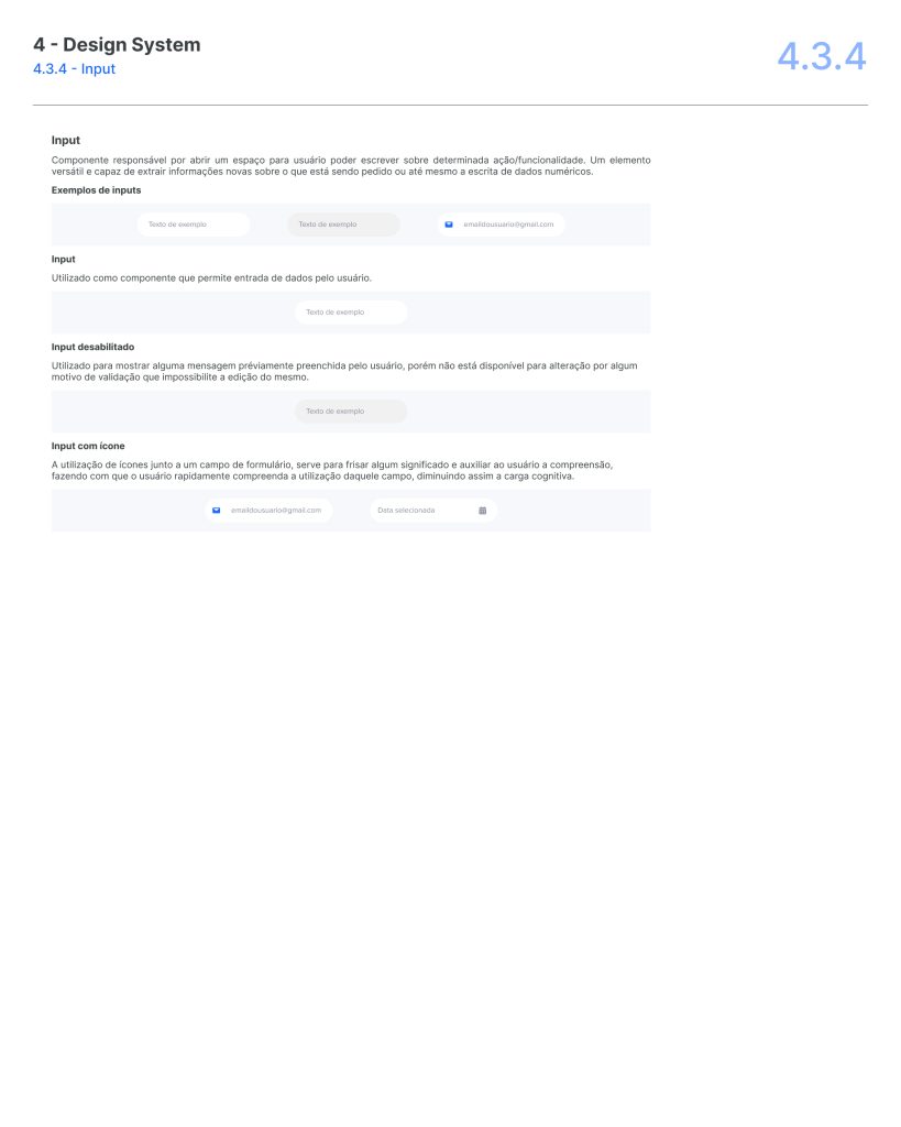
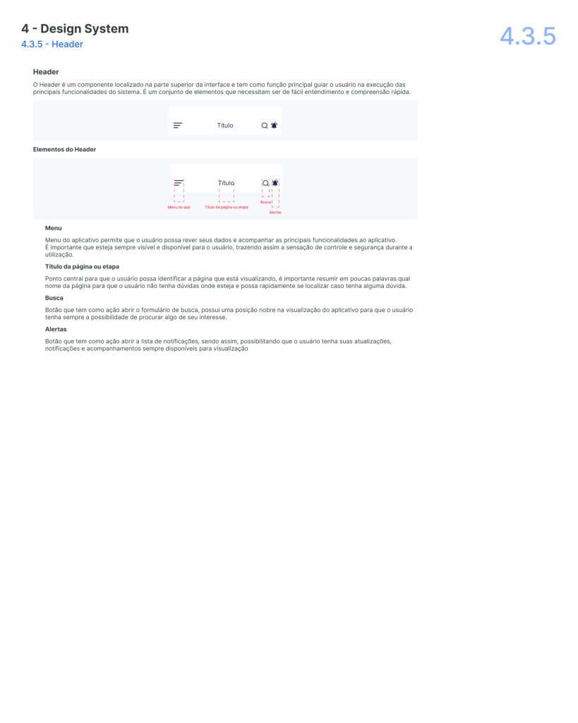
Design and Brand Guidelines

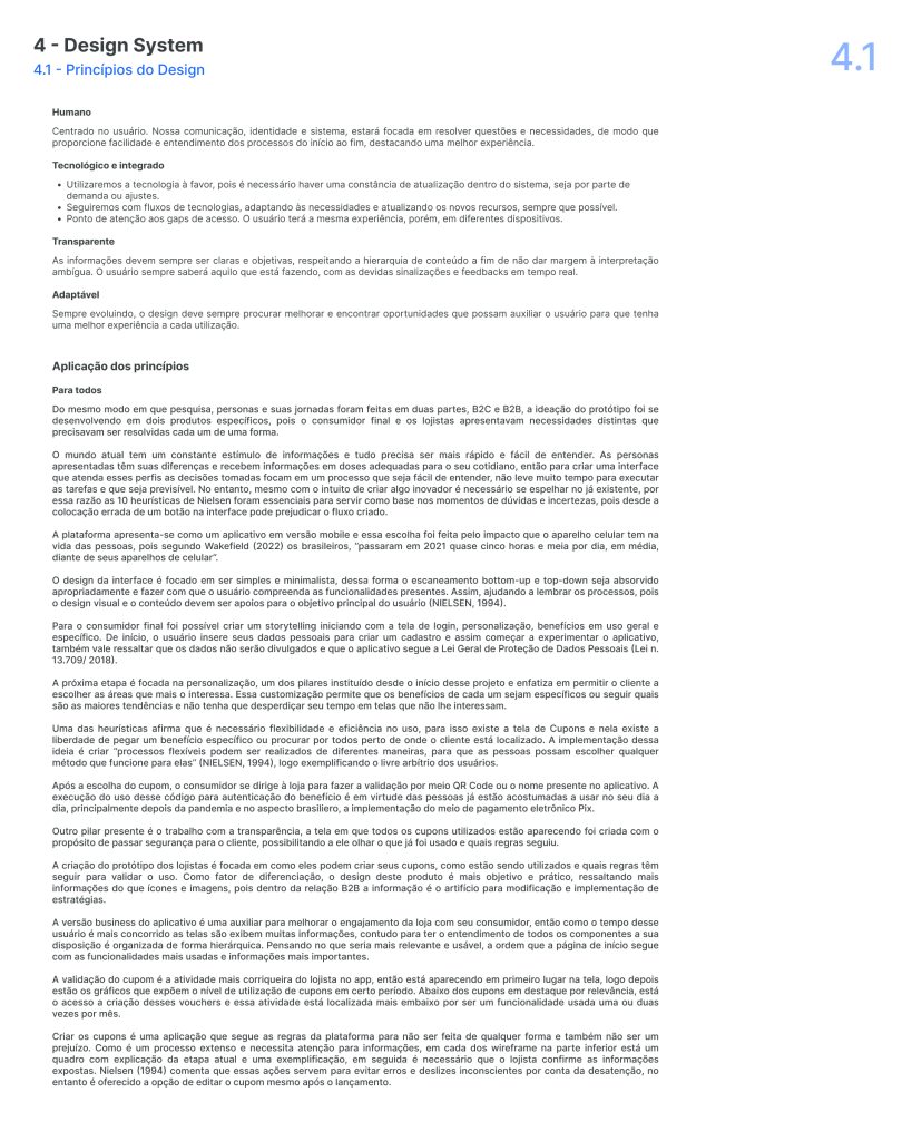
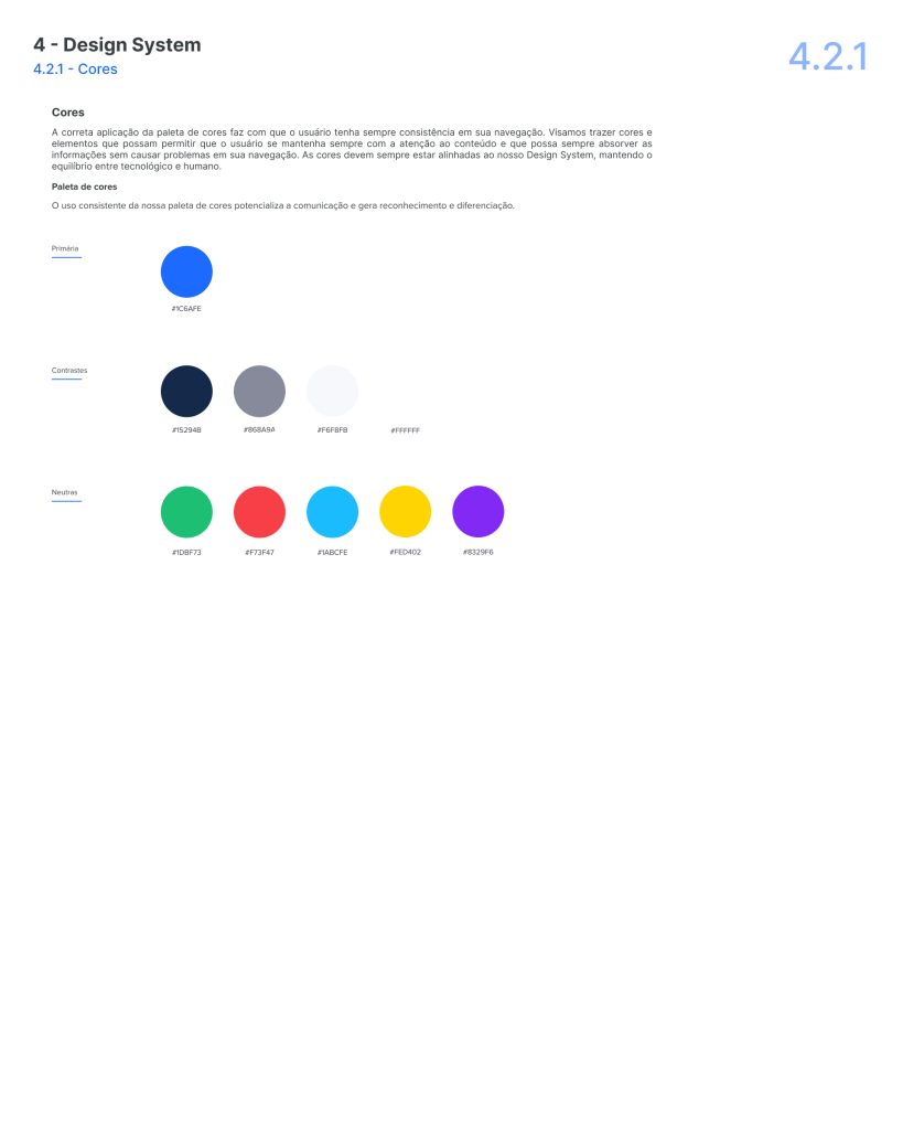
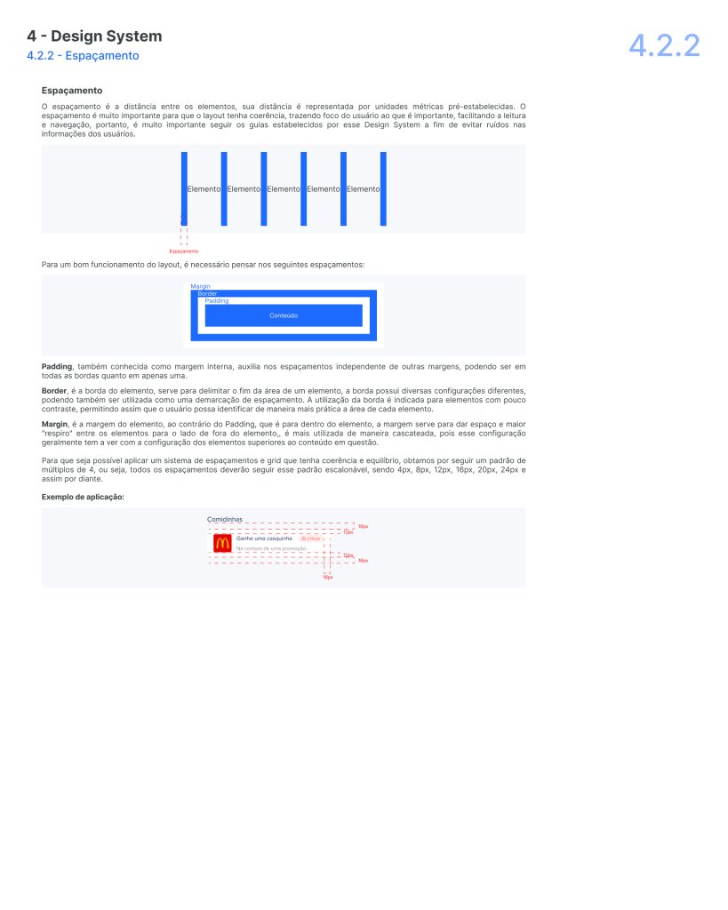
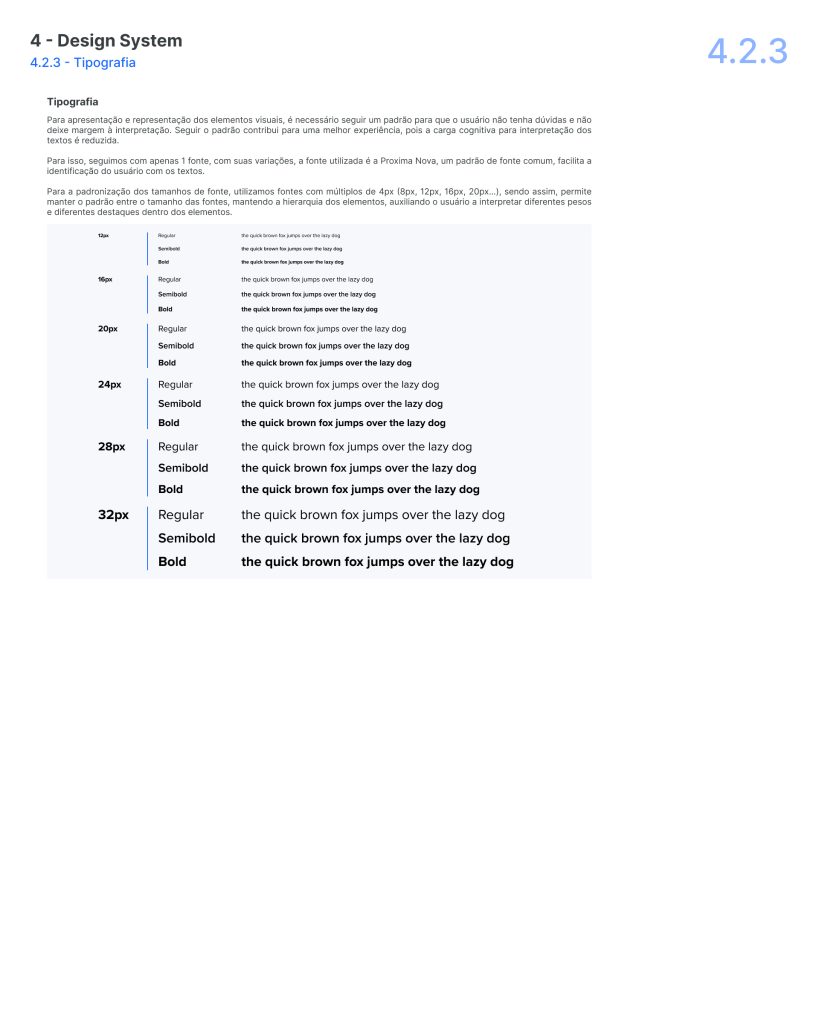
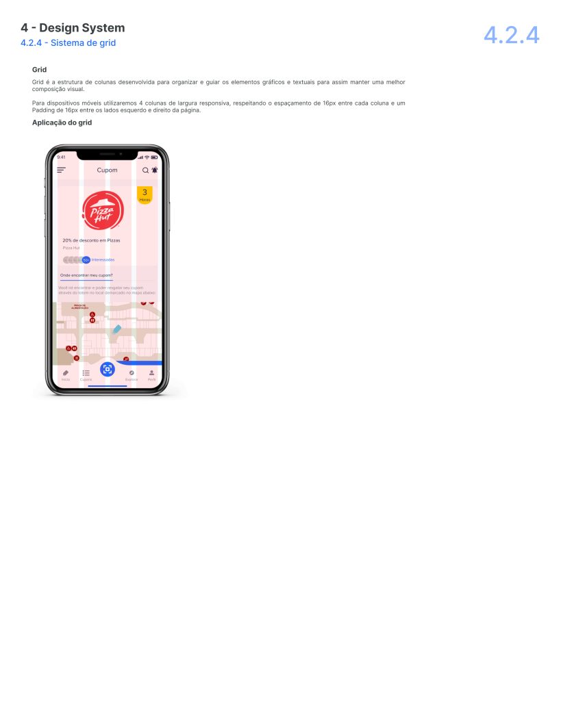
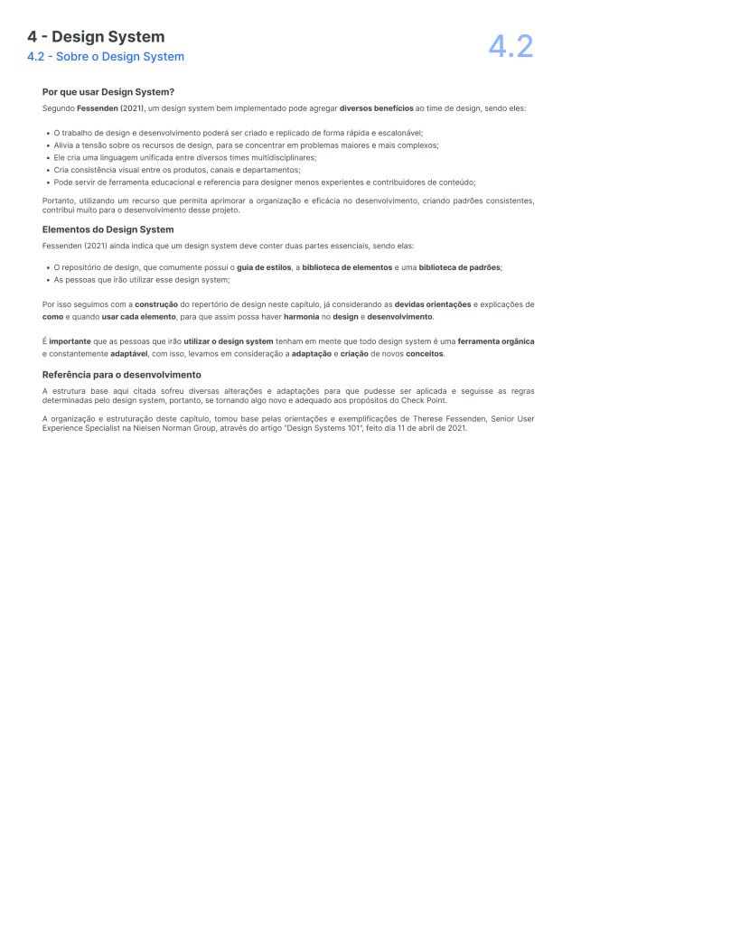
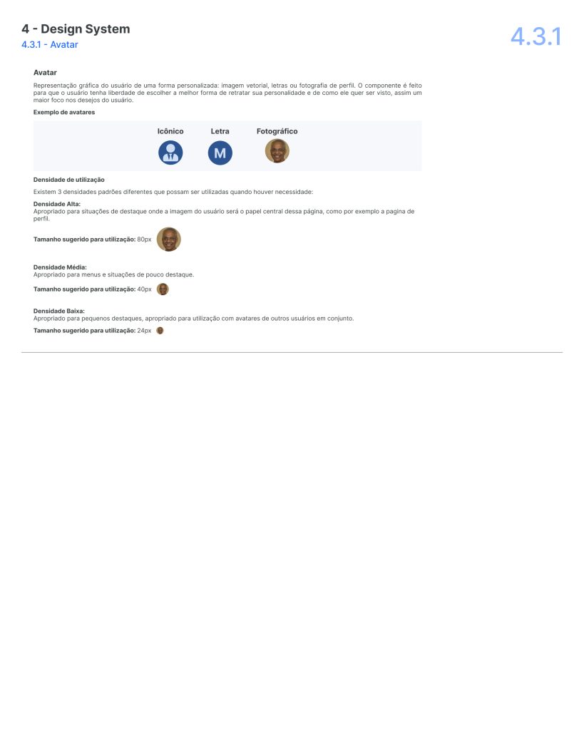
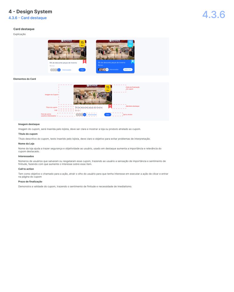
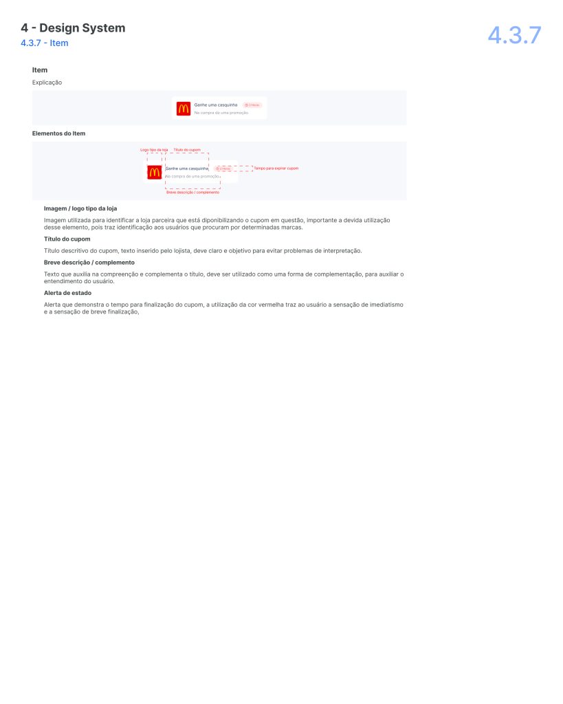
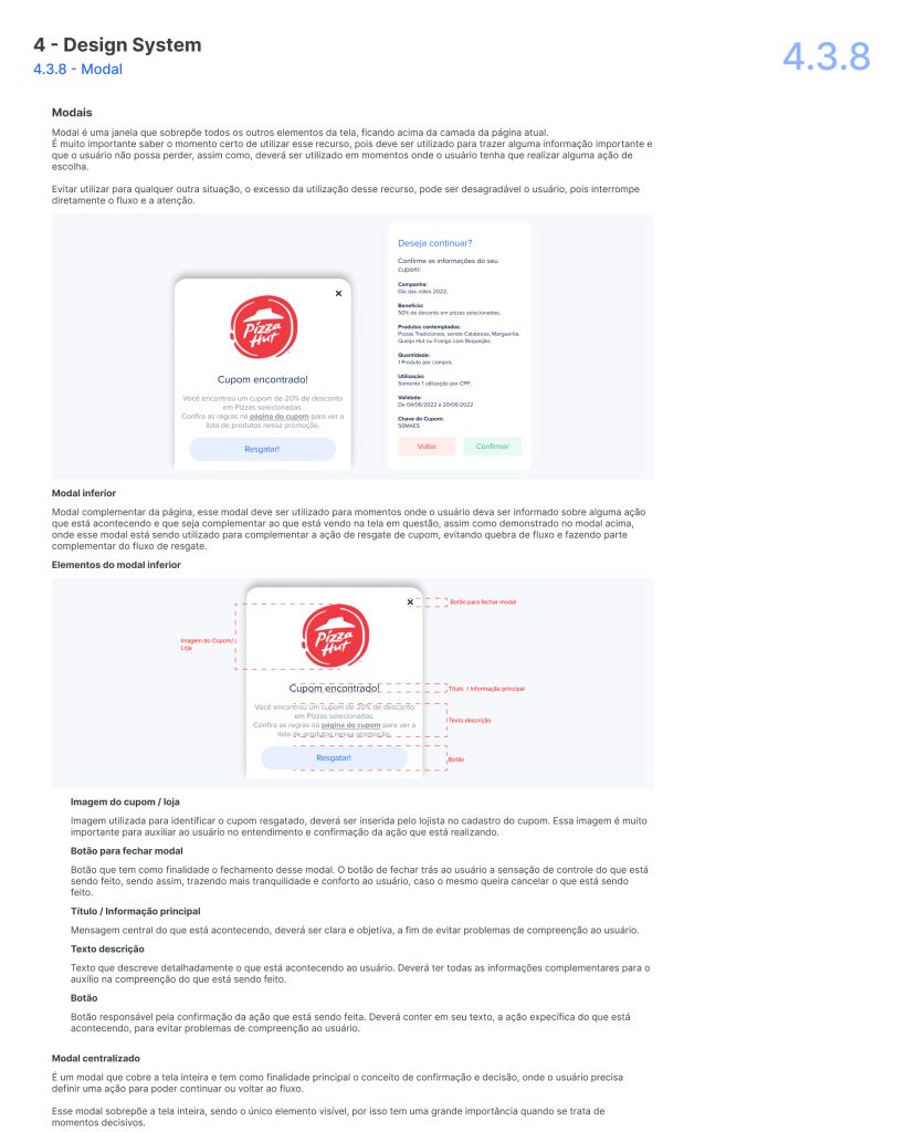
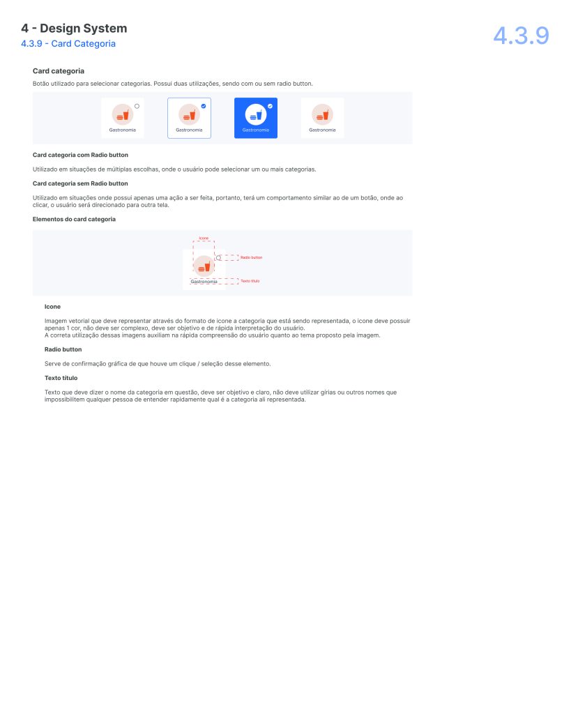
A comprehensive set of design guidelines was created, including UI components, color schemes, typography, and other visual elements to ensure consistency across the application.

User Manuals

Created detailed user manuals for both B2C and B2B segments, outlining step-by-step instructions on navigating the app and utilizing its features effectively.

This website stores cookies on your computer. Cookie Policy